
A polished deck can still lose the room. People can’t find your point, can’t read the screen, or can’t tell why a number matters. Adding another graphic won’t fix that. Removing whatever makes listening harder will.
These seven mistakes cover how you open, explain your evidence, control the deck and finish. Each one has a fix you can use in a sales pitch, team update, training session or conference talk.

1. Starting with background instead of a reason to listen
An agenda tells people what you will cover. It does not tell them why they should care.
If you open with company history, introductions and a contents slide, you ask the audience to wait for the relevant part. People came for a decision, an answer or help with a problem.
Open with the audience’s stake. Finish this sentence before you build anything: “After this talk, these people should be able to ___.” Then build your opening around the answer.
Swap “Today’s agenda: process, findings and recommendations” for “We need to decide which onboarding change to test next.” Background can come later, once it helps people understand your recommendation.
Try this check on your first two slides. Could someone who hears no explanation work out the problem and the purpose of the session? If not, move the useful point forward.
2. Turning every slide into a script
When a slide is full of paragraphs, people read ahead of you. If you read it aloud, you add nothing. If you say something different, the screen gets harder to follow.
Give each slide one job. It can make a claim, show evidence, explain a process or start a discussion. Move everything else into your presenter notes or a handout.
For a status update, skip the six bullets about completed work and blockers. Use a headline such as “The launch date now depends on security approval.” Put the timeline under it, and explain the rest out loud.
Some text earns its place, such as a short quote or a definition people need to read. If a sentence only exists to remind you what to say, delete it from the slide and keep it in your notes.
3. Designing for your laptop instead of the room
A label that looks fine two feet from your laptop can vanish on a projector across a meeting room. Pale colors, thin lines and crowded screenshots make it worse.
Test with the real display, the real lighting and the real distance. Stand at the back and read the smallest detail that matters. If you can’t read it, the audience can’t either.
Common fixes:
- Enlarge the text and shorten the wording
- Crop screenshots to the task and highlight the control
- Increase chart contrast and label the key values directly
- Add labels or symbols, so meaning does not depend on color alone
If a detail can’t stay readable, split it across slides or share it in a handout. Shrinking everything until it fits only makes it harder to read.
4. Using effects that compete with your message
Animation can show a sequence or reveal a point at the right moment. It becomes a distraction when people notice the effect more than the idea.
Spinning titles and constantly changing transitions make the audience keep adjusting. They also make navigation awkward when you need several clicks to finish one sentence.
Keep an effect only if you can say what it explains. Revealing three steps in order helps people follow a process. A bouncing heading does not.
Rehearse a section with the animations turned off. If it gets clearer, simplify. If it gets harder to follow, bring back only the builds that help. Our guide to choosing transitions in PowerPoint and Keynote can help.
Check that you can go backward too. When someone asks a question, you may need to return to an earlier slide, and the deck should still make sense.
5. Showing numbers without explaining them
A chart can be easy to read and still leave people wondering what they should conclude. Every important number needs a measure, a comparison and a consequence.
“Average resolution time: 36 hours” tells people very little. “Average resolution time fell from 48 to 36 hours after the routing change” tells them what happened and why it matters.
Put that conclusion in the slide title and let the chart show the evidence. Do not claim more than the data supports. Faster resolution does not prove customers got better answers.
Before you present, be ready to explain the metric’s definition, time period and source. If a limitation would change the audience’s decision, show it on the slide, not in a footnote.

6. Letting the controls interrupt your delivery
Every trip back to the laptop breaks your rhythm. So does turning your back to check the screen or looking down after each slide change.
Set up the room so you can face the audience and see where you are in the deck with a quick glance. A wireless remote gives you that freedom. Move to address another part of the room or to mark a new section, not because you feel you should pace.
Write your presenter notes as prompts. A few cue words, one key figure or the line that leads into your next point is enough. A full script keeps your eyes down.
Mac users have several ways to present Keynote without a physical clicker. Whatever you choose, practice going forward, going back and recovering from an accidental click. Also decide in advance how you will carry on from the laptop if your remote stops working.
7. Rehearsing the slides but not the whole talk
Reading through a deck silently is useful editing. It does not show you how long your explanation takes, where your transitions feel awkward or which detour eats your time.
Rehearse out loud, with the notes and controls you will really use. Run the opening, the section changes, any demo and the final request. Time each section separately. If the introduction runs long, fix it there instead of planning to speak faster later.
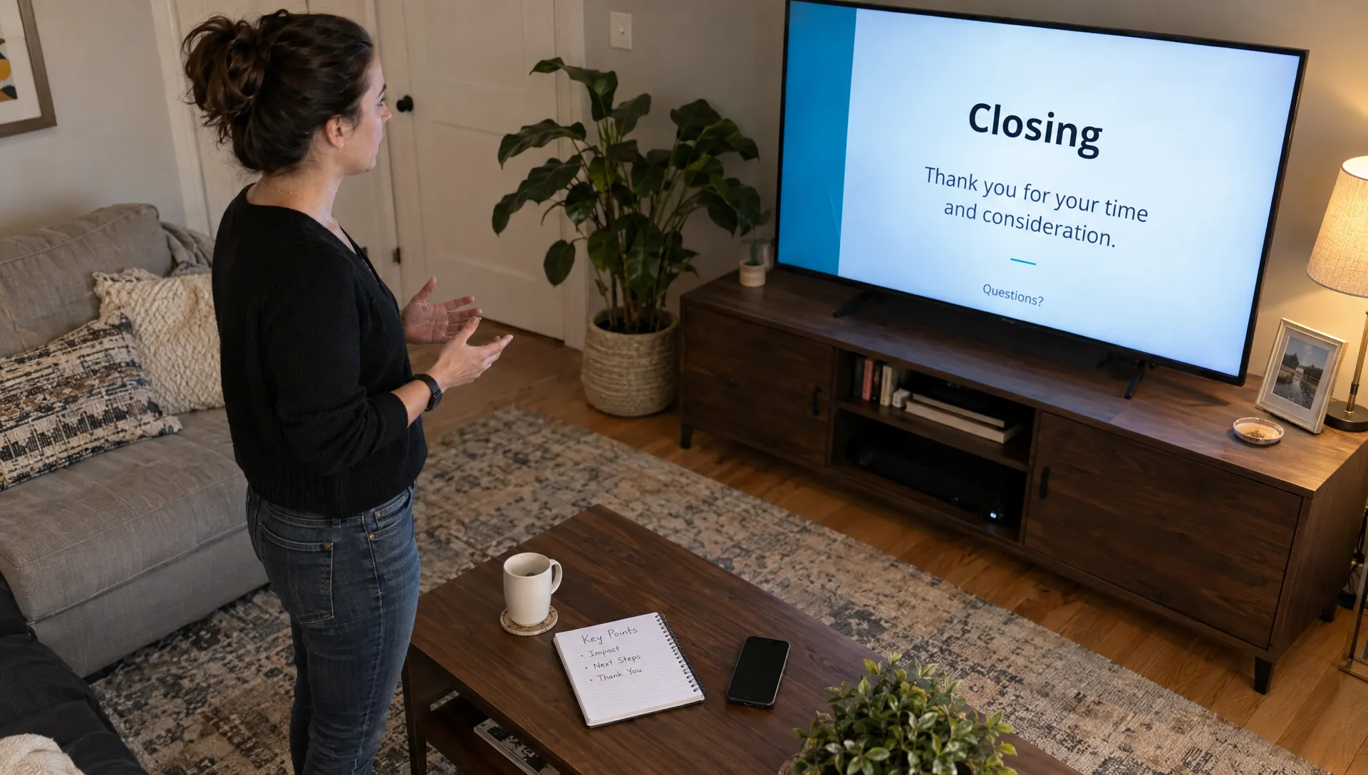
Give the ending the most attention. Saying “That’s everything” only tells people you have stopped. Finish with the main takeaway and the next step, such as a decision and a deadline, or the first task participants should try.
Also plan a shorter route through the material. Know which examples you can skip if time runs out without losing the reasoning behind your conclusion.
Make slide control one less thing to think about
Once your message is clear, choose controls that stay out of the way. Clicker turns your iPhone or iPad into a wireless presentation remote for Keynote and PowerPoint on Mac, with QR code pairing, presenter notes on your phone and volume-button navigation.